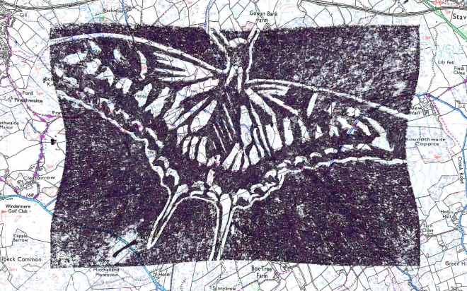
Today we were continuing to develop our mono and lino prints. However, this development was to be done digitally on a software program called Adobe Photoshop CC. Initially I selected 4 of my prints, as images I wanted to manipulate, but once getting them onto the computer I then decided I only wanted to use one print (image below) as the only piece I was going to manipulate. However I wanted to manipulate it over and over again in different ways.
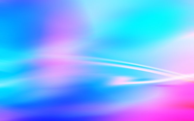
Once I got the image imported onto photoshop, I then went onto google images and searched for a variety of different organic images which I could use as a layer on top of the butterfly. First I chose to search for colours that could be seen upon the vibrant wings of a butterfly. I came across a blend of purple and blue. I thought this would look good to incorporate into the butterfly as it is vibrant and a nice blend of colour.
This is the image I found:
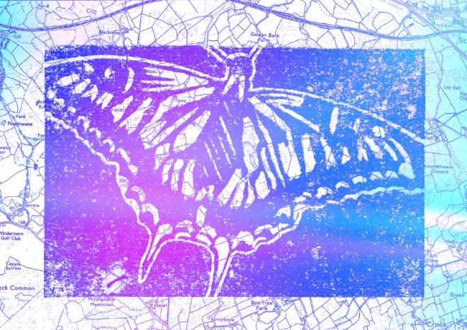
This is the first on my digitally manipulated images. For this one, all I did was put the 2 images together as separate layers, putting the colours on top of the butterfly, then reducing the layers opacity to that each layer can be seen through the other.
I altered the contrast and brightness on the butterfly layer, as the I wanted the butterfly to be bold enough beneath the colours.
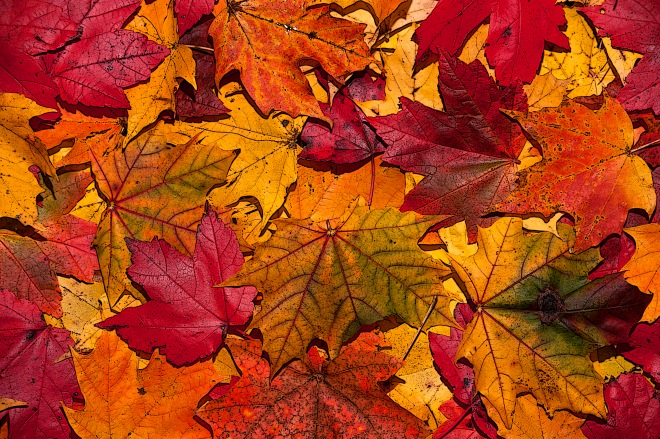
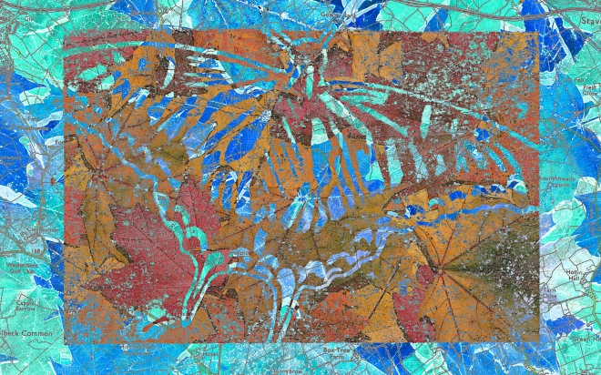
The following piece I created I wanted to use leaves as I thought they would also work as they are easily identifiable organic forms. However after I began to play with the various affects, it became apparent that the leaves were too contrasting, so it was really tough to make out the shape of the butterfly underneath them. I decided to start changing the saturation of the leaves, and after many changes, I reversed the colours of both images, so when they layered, they then looked like a negative photo in the background, but the butterfly itself still has natural coloured leaves visible.
Then I decided to see if I could actually combine an image of butterflies, with the butterfly print. I found this image:
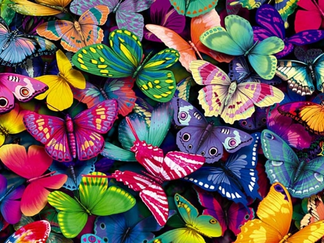
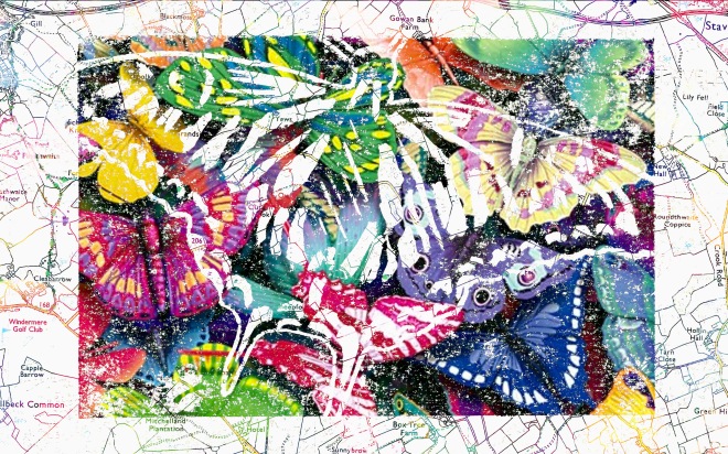
I thought the above image would be really good as it was filled with a range of vibrant colours which wouldn’t clash because the print is mainly black and white. Once I actually got the 2 images together, I just played with a range of pre-made filters of opacity and contrast alterations. I selected one which worked really well. I thought this because the butterflies are visible in the black part of the print, but not so much on the map section. I really liked this affect as it puts more focus onto the main print, rather than the background. This was my favourite manipulation because this had links between each layer as butterflies occured on both layers. Along with this, I really like the vast variety of vibrant colours. The image below is the final piece:
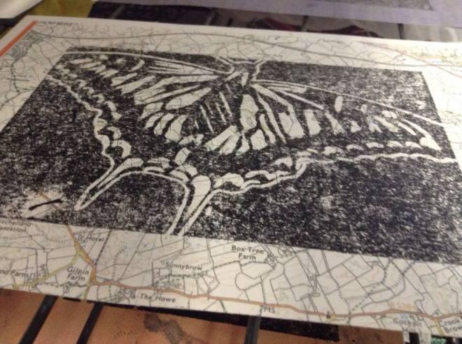
Finally, rather than adding layers to this print, I decided to distort the box around the butterfly and the map. I decided to do this because I wanted at least one alternative technique for my final pieces, than always using layers on Photoshop. I also slightly increased the saturation of the image, which seemed to turn the inked section a dim shade of purple instead of black. The image below is the final piece: