Introduction
This project we began is Organic 1, which has a duration of 7 weeks. Organic 1 is a 2D exploration of 3 units; Unit 3, Unit 4 and Unit 5.
‘Unit 3 – an introduction to drawing skills. This unit will provide the student with an introduction to drawing skills necessary to support creative activity in art and design.’
‘Unit 4 – Introduction to communication skills in Art and Design. This unit will provide the student with an introduction to the communication skills used in support of art and design. The unit will also develop an understanding of the role that communication skills play in informing and developing ideas.’
‘Unit 5 – Solving 2D problems. To provide the student with an opportunity to use previously acquired skills, knowledge and understanding to work toward the solution of a defined 2D art and design problem.’
The theme is called Organic 1. This theme consisted of looking at a variety of organic forms and taking inspiration from them for various artworks. I was looking forward to working with all kinds of forms such as shells, fruits, plants, and leaves. As well as these forms, I also used a variety of images of organic forms such as trees, landscapes, butterflies, and birds. I find natural forms extremely interesting as they have formed themselves and can contain extremely complex and intricate structures.
I aimed to improve and develop all of my skills. I wanted to further my drawing techniques as I had never been satisfied with drawings and sketches I have done in the past. I also wanted to improve my printing skills, mainly mono and lino printing. This is because I had only done mono printing once before which was last term during the Identity project. I had previously done lino printing at school, but I wanted to increase my skills further. I was really looking forward to working on Photoshop as I really enjoy digitally manipulating and editing images. Along with this, all aspects of photography within the project was an excitement for me.
In addition to what I was looking forward to, I also wanted to keep up with my time keeping skills, as I was really good at staying up to date with my blog posts last term. Along with this, I wanted to spend more time to work independently to create pieces of work, with my own ideas, therefore having a larger range of practical work. However, doing this, meant I had to create additional blog posts about the extra practical work I was doing. This meant I began to fall behind with my blog posts, but I did manage to catch up and get back on track fairly quickly.
Summary of research
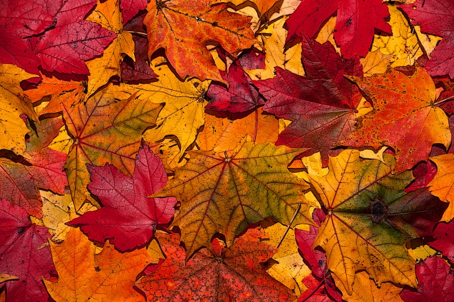
After being introduced to the brief, as a class, we were given a variety of organic objects and were told to take a variety of photos of them all. We had to think about composition and lighting. I set up a small studio space with both white and black backgrounds, then used our phone torches to light up the items in different ways. I really enjoyed doing this as it was a way of portraying the way we see the objects, using our own photographic eye. Along with this photoshoot, I also took time outside of college to do a photoshoot in one of the forests near where I live. I chose the forest as the rivers were fully flowing, the trees and ground were very vibrant with autumn colour and I chose a day with decent light. This was the only external photoshoot I did, with the intentions of the organic project.
I believe it is extremely important to take my own photos and do primary research because by finding my own research instead of using secondary sources, it is more authentic. Along with this, by experiencing things first hand will most likely make me remember more as I am seeing things upfront and in full detail so that I can explore every aspect and angle of my surroundings. Also by seeing objects and organisms up close, it provokes personal emotions and thoughts for me.
The below images are from my 2 photoshoots:
Throughout this project we studied a diverse range of artists. However, there were 2 artists that I specifically enjoyed looking at most, these were Henry Moore and Angie Lewin.
Henry Moore
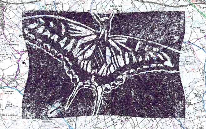
I really liked looking at Henry Moore as an inspiring artist for mark making. As a sculptor he creates plans, and those plans are drawings. Then he will then release his plans as an actual piece of artwork. I find this extremely interesting, as I often sketch out plans in a lot of detail. I also found his use of mark making skills interesting, as he uses a lot of the techniques that we were taught. Moores work inspired mine, as it gave me ideas about how to create shades and tones within a drawing or a plan. This lead to me using these techniques and putting them into practice during my scaling up drawing.
Below are some images of Henry Moore, his work, and the piece of work I did which he inspired:
Angie Lewin
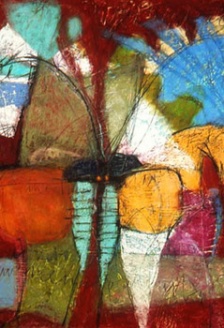
Angie Lewin was another artist I really enjoyed looking at because she created incredibly detailed and precise prints. As a print maker, she uses Lino cut and creates various pieces for home decor such as curtains, wall paper and bed sheets. I have always had an interest in Lino printing and its process. To see an artists work, which contains such large scale, smooth marks was very inspiring to me. Therefore I am now wanting to create some kind of large scale print in my future work (larger than the A6 piece we did in lesson).
Below is a Lino print done by Angie Lewin, and a Lino print done by myself.
For research, I used a variety of platforms and sources. I mostly used the internet which lead to looking at artists personal websites, autobiographies, biographies and wikipedia pages. Along with using my surroundings, and at one stage a couple of the books I have at home.
The internet was the quickest source for information. Along with this, it is much more reliable than finding information in the media.
Experimentation and development
There was a large variety of workshops I took part in with my class, as well as some I did on my own;
- Mark Making
- Tonal drawing
- Facial Proportions
- Perspective and atmospheric drawing
- Mixed media drawings
- Organic Photoshoot
- Scaling up
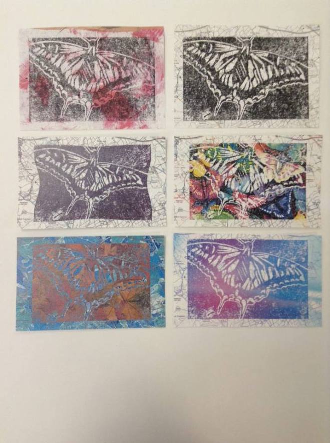
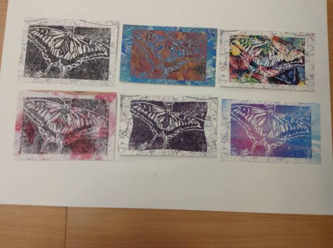
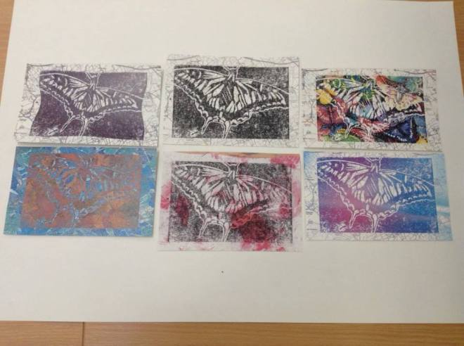
- Mono Printing
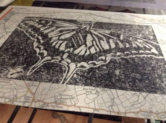
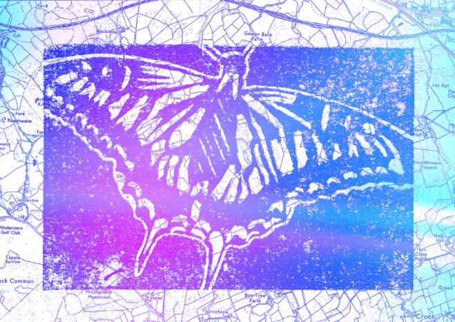
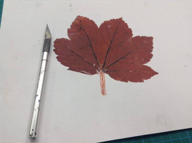
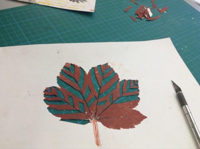
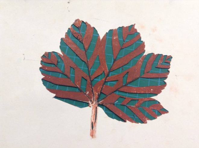
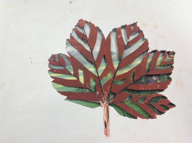
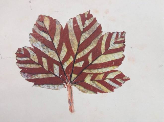
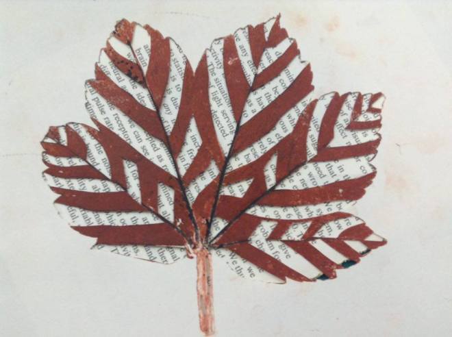
- Lino Printing
- Positive and resistant prints
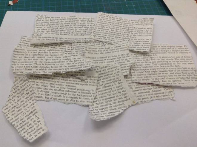
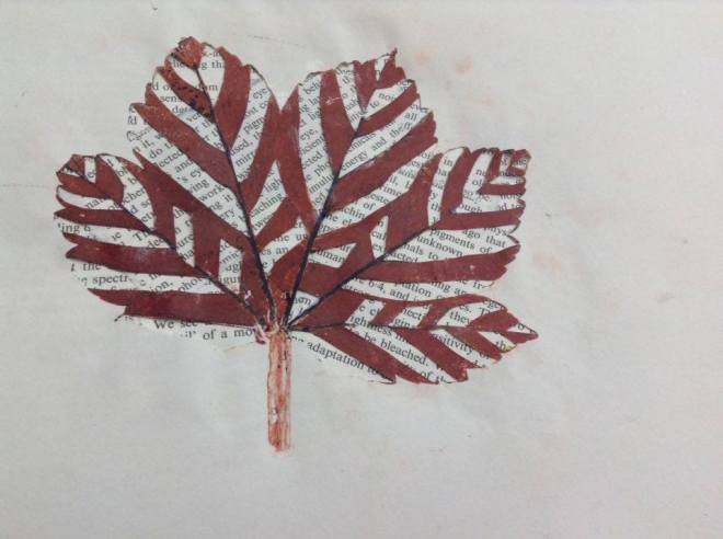
- Photoshop manipulation
I definitely learned new skills within all of these workshops, however I had some basic and developed knowledge on each workshop beforehand, which I feel I have improved and built on further.
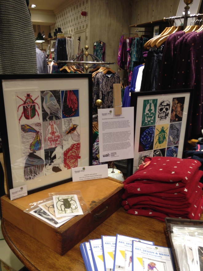
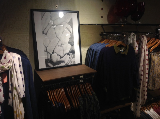
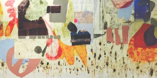
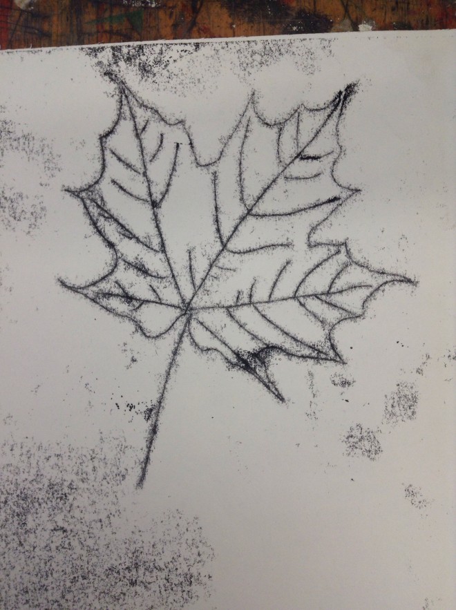
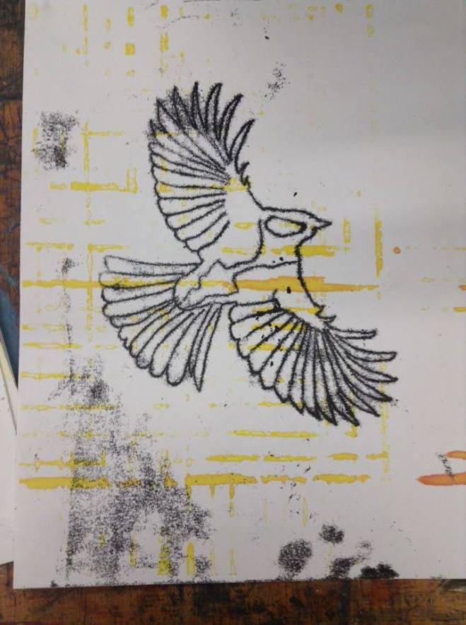
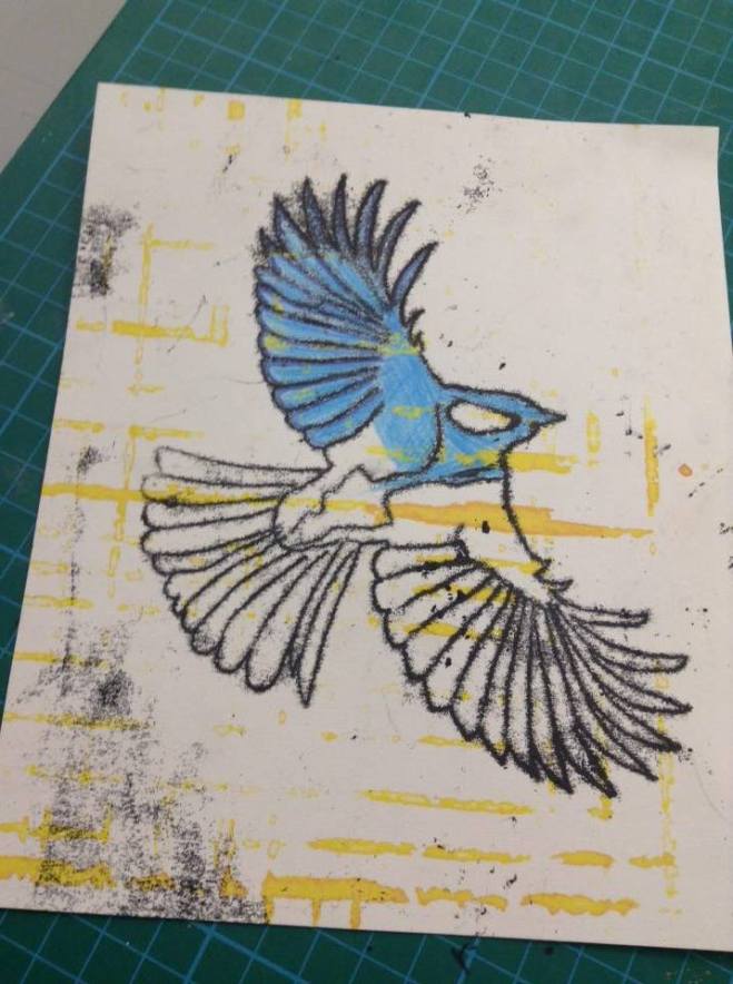
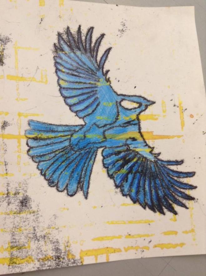
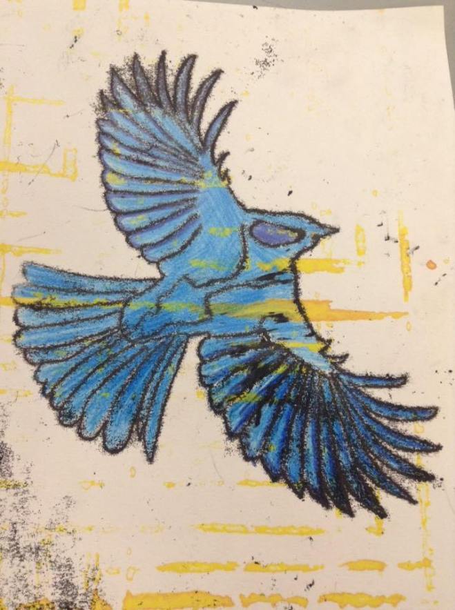
Below are a variety of images from the different workshops I took a part in:
I feel that all of the workshops went successfully, even if things didn’t work out, I learned from the mistakes I made. Along with this, I extremely enjoyed every workshop, which I believe is a key to being successful in lessons and with my work.
In the Mono printing workshop, I often came across issues such as over inking and not as precise marks I had hoped for. To fix these issues, I blotted my last pieces quite a lot so that there was less ink on the final acetate sheet. But the pieces I already made which had too much ink on, I still used, and played with the messy affect when working back into them. To make the marks better, I applied more pressure when making my later prints. In the Lino printing workshop I also found I struggled to make the lines perfectly precise and smooth when cutting out the lino. To fix this, I need to practise doing more Lino cuts in the future.
Another workshop, I also came across issues with, was the scaling up drawing workshop. I found, after sketching out the basic design, I couldn’t really see the piece coming to life. I struggled massively to keep working on the piece as I began to lose interest. To fix this, I pursued the drawing and pushed through it. As I added shading and definition to the piece, in gradual intervals, I had the piece held up on the other side of the room to me so that I could see it from a distance. Eventually I could see the drawing coming together, then I was extremely proud of the outcome.
There were 2 workshops I enjoyed the most. These were the scaling up and positive & resistant prints workshops. I enjoyed the scaling up drawing workshop considerably because as I was creating the piece, I had no faith. But once it came to life I was proud of what I achieved. I was also proud of myself for pursuing the piece, which taught me the lesson of seeing a drawing through until the end, before deciding against it. I enjoyed the positive and resistant prints work shop because I spent the time on my own to create the prints. Therefore I could use the space around me to the best of my abilities. I was also really proud of how realistic the outcomes were for each print. It was good for me to learn how to use the press, and what techniques worked for certain kinds of prints. Which is why I also enjoyed this workshop a lot.
Reflection
Throughout the whole of the project, there were a series of deadlines to complete work each week. Over the first 2 weeks, I achieved meeting the deadlines every time, however one week, I didn’t complete my work on time. This lead to work building up over some more weeks. To sort this, I spent time after college, and on my days off, to catch up with work. I find I focus better and complete work quicker when I am in the college environment.
For this project, I mainly enjoyed doing the all different workshops, making mistakes, learning from them and trying again. I find this is the best way to improve and develop my skills and knowledge because to see the mistakes appear in my work, which I do not want to repeat them unless I intend to.
I find I managed my time in and out of the class room differently to how I did last term. This term I found my friendships in class disturbed me considerably more than they did last term. I struggled massively to focus in lessons, unless I had earphones in. To fix this, I think I may have to separate myself from them, specifically in blog work lessons, in the next project. However outside of class, I continued to work well at home, completing and catching up with blog work on my days off. I did find I get distracted easily at home, however I set myself a schedule and plan to follow each day, to make sure I was completing a comfortable amount of work each week.
If I had to do this project again, I would try to do more practical work of my own, outside of class time. This is because I would like to have a larger range of pieces, some of which I have created in my own time following my own plan which will set some of my work apart from the rest of the class. I would also try to create more of a range of work in the actual workshops we did. For example, if it was in the Mono printing workshop, I would have created more test prints and final pieces, as this would have given me a larger range of work which I can use and develop on from.
I see my work developing on in a much cleaner and smooth way. What I mean by this is I think as I now have rounded knowledge in a lot of workshops, I can now begin to push my skills and improve them as I don’t have to be introduced to the techniques and processes again. I also see my work beginning to alter into different scales, as I would specifically like to work on a larger scale. In addition to this, I do see my work becoming more refined. I think this because I am learning how to commit to a piece, developing it until I am happy with it, rather than giving up on it when I start to lose faith.
On the next project, I think I will try to keep up to date each week with my blog work without leaving any posts outstanding. This is because once I start to fall behind, I either struggle massively to stay as up to date as possible, or I feel the snowball effect which will eventually lead to me achieving very little. Secondly, I think I will try to take my attention away from my friends during lessons, and try to focus on my work during lesson time, leaving socialising for break/lunch times. In addition to these, I also think I am going to try to make more of an effort in refining and completing every workshop.


You must be logged in to post a comment.