Artist Research – Angie Lewin

As Angie Lewin is a contemporary artists, there is very little to no information available about her personal life, and there is only a small amount about her working career.


Angie Lewin is an English print maker mainly working in lino cut, screen printing and wood engraving. She initially worked in London as an illustrator, but then she began to study horticulture. Then she moved to Norfolk where she returned to printmaking. She would design fabrics for different companies. Lewin has also done commissions for Penguin, Picador and Conran Octopus.

Lewin uses a strict set of media to print with, however she does have a range of surfaces which she prints on. Such as; fabrics, paper, and card. She also uses very large sheets on lino that she cuts into, therefore creating large sized prints such as A3/A2.

As an artist, Lewin is inspired by the environment and many natural forms. She takes time to go out into her surroundings, and as a form of research she will sketch up basic forms to influence her plans for her prints.


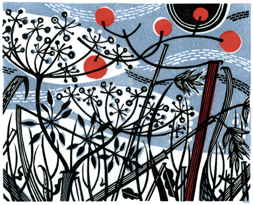
The image below is a print made by Lewin onto fabric which already had a pattern on it. The picture contains a variety of natural shapes which Lewin has adapted into more basic shapes, mainly plants and flowers. She has used a linocut, and then printed it down onto fabric with ink. However, after she has created the print, Lewin will scan it and edit/adjust it digitally. After this the pattern is repeated to create the plan for another kind of surface such as a curtain wallpaper etc. The colours are very controlled and specific to the section it is places. The black is very bold however the red contrasts and conflicts against it. Although, they do work well together.

The lines are very controlled and precise. The edges of the print are extremely smooth which is amazing as it is very hard to get a perfectly even edge when cutting lino. The shapes are very clever as they look like plants in how they are shaped, however, they also look unreal in another sense as they have no detail within them. The marks have been made using very careful and gentle cuts with the cutter.

This piece makes me feel like a Winter season scene. This is because the white in the background leads me to think about snow as it is in little fragments. Along with this, there is a block of white lower down, which I see as snow on the ground. Therefore this image makes me feel very happy and festive, as Christmas/Winter is my favourite time of year due to the snow.

alewin_winterspey


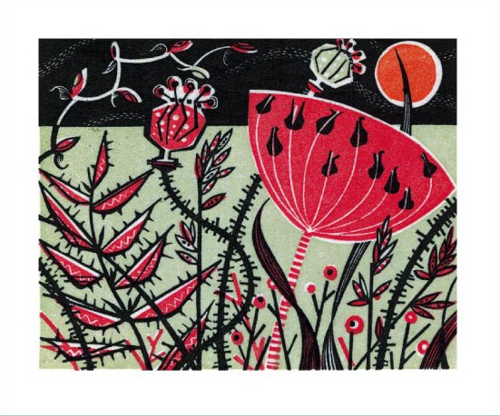
The picture below is another large linocut, exploring floral and environmental scenes. This image is very contrasting to the previous image. I think this because I feel it is quite a damaging and vicious image with the spikes and strong use of red.

She has used a variety of sharp and curved lines in this piece. Which again gives it a very aggressive kind of feel to it as there is so many small sharp marks. Lewin has also made some thin marks in this piece, as well as the bold/sharp marks.

Red-Meadow-by-Angie-Lewin

I would like to use some of Angie Lewin’s pieces and processes as inspiration for my future work. This is because I would really like to see what it is like creating a piece on that kind of scale. Secondly, I find her process of researching and planning for a print very interesting because she takes time to do her own primary research instead of copying imaging of the internet.

Lino printing workshop


For this lesson, we pushed the skills we had learned during our lino printing demo lesson. To start with, we were shown a range of images which we had to choose one of to make our prints of.

I chose an image of a butterfly as I thought it would be a good picture to make a print from. It had a lot of sections in it which I knew I would have to cut out, however, they were simple and basic lines I’d have to cut. Here is the image I chose:

12325211_911262605588023_2117238903_n

After I chose the image I wished to use, I collected the equipment necessary to trace the image across onto lino and to cut it out. I then traced the basic outlines and shapes of the bottom butterfly out onto tracing paper. (I chose the bottom butterfly because it scaled up well to fit onto my piece on lino)/

After doing this, I retraced the image onto the lino using a pencil to copy over the lines, then a biro to make the lines bolder. I chose to trace the image because I wanted to have a fairly precise image onto my lino, as the lino is already difficult enough to create an image with.

12306024_911262248921392_197205647_n12336091_911262268921390_591117125_n12312423_911262318921385_1544191830_n12325207_911262355588048_383053356_n

After going over the lines with a biro, I then coloured in with a biro the sections I was wishing to cut out that way it was clear to me what bit I needed to remove to create a successful print.

12309086_911262368921380_1054693404_n

At this point I had only cut out part of the lino, this is because I wanted to do a test print to see how the print was developing. There is no image to show how the print was developing because I forgot to take a photo of the print, which I no longer know where it is. But the image below shows the lino partially cut:

12305511_911262425588041_1898593991_n

The image below shows the final piece of cut lino:

12309151_911262462254704_956494900_n

After cutting it out, I then started to do some proper prints onto various surfaces that were around the workshop.

12312436_911262478921369_73975726_n

I chose a fabric background because I wanted to see what it was like printing onto fabric, and how the prints turn out when on fabric. I also wanted to have a range of surfaces that I had print onto. However there was only, paper/card or fabric for surfaces.

12335878_911262495588034_1855103924_n

I chose the map as a background because it was a map of my home town, as well as I felt there was a link between the butterfly and the map. This is because a butterfly can travel far distances all over the world, and I think a map represents distances and travelling.

12285669_911262545588029_1660525771_n

I then chose a fairly plain purple background which has a cross-hatching pattern on it. I chose this because I also wanted a simple background in case I wanted to work back into the pattern later on.

12278184_911262568921360_1823751478_n

I then chose this background because I absolutely loved the vibrant colours and as a backround it brought life to the print. I thought this because most butterflies are full of saturated colours on their wings, which I wanted to give my butterfly.


Throughout the process, I found I had a couple of issues. The main problem I had was that the ink got everywhere which was difficult when I was trying to take photos midway through the process. To solve this, I had to keep cleaning my hands, to make sure my were as clean as possible before I handled my phone. The other issue I had was after doing the test print, part way through cutting the lino, I struggled to get the ink off the lino, to be able to continue cutting the lino. To overcome this issue, I spent a fair amount of time trying to remove as much ink as possible so that the drawn biro pattern became visible again.

An additional issue I had was that my lino wouldn’t pick up the ink, therefore the block sections of colour on my prints, weren’t all black, they were more speckled.

I enjoyed cutting out the lino because it is a steady and easy process if done slowly and correctly.


Lino printing demo

Today we were introduced to Lino printing. This is a process of getting a sheet of lino material, and cutting into it with specific tools to create a stamp, ink is added to its surface, it is then printed creating a pattern that can be repeated.

12319242_911684415545842_884303108_n

Initially we were in the class room, and introduced to the process. We watched a short clip about a British Printmaker, Angie Lewin, who works by creating prints, digitalising them, multiplying them and adding them to fabrics for curtains and wallpapers.

After watching this video and going over the health and safety for lino printing, we went into the print room to start a test piece. I have done lino before when I was at school, therefore I had what I think was a fairly detailed understanding and knowledge about how lino printing works, the techniques necessary and possible dangers of lino printing.

Health and Safety

  • Warm up the lino on a radiator if it is stiff. This is because trying to cut into hard lino can be dangerous, as you have to apply more pressure to cut the lino, therefore if you slip, you are more likely to cause a lot of damage to yourself or something around you. By warming it up on the radiator, it softens, making it easier to cut.
  • Use a table guard. This is because a table guard holds the lino in place, so that you can remove your free hand from having to hold it still. This reduces the chance of injury also.

It is also a good idea to print every so often as you are cutting out the lino. This is because you can see the progression of your piece as it gets cut. You can also see what is and isn’t working, therefore being able to alter the piece as you are still working.

To start off, we were given a demo which our tutor explained how to use the tools, the different blades, and how the marks you make alter depending on which blade you use. The graph below shows each blade, and the different cuts each one makes:

lino_cuttersgraph

After our demo, we picked up a variety of equipment to be able to make a small test piece.

Equipment list

  • Lino Cutter
  • Blades
  • Table guard
  • Hand guard
  • Lino sheet
  • Ink
  • Roller
  • Acetate sheet
  • Newsprint

After collecting our equipment, it was simply a process of trying to test out making a variety of marks on the lino piece. I tried making 3 straight lines to start with, just to get the feel again of how to cut the lino. Then I tried cross hatching, to simply see how it would look when printed. I then did my initials forwards, and backwards, to show when it is printed, that letters are reversed. I then tried to do one long straight cut from the bottom to top, I slipped half way through it, so had to continue the line from midway on the piece to finish off the line. Then I tried what it was like curling and making more round lines, which was fairly easy. I also pushed the cutter into the piece, then spun the piece of lino itself 360 degrees so it cut out a small hole. I found this worked better than trying to cut out a small circle with the tool.

12335902_911712365543047_382965083_n

After making the test piece, I inked up my acetate sheet with black ink, preparing to print the piece.

12308925_911712348876382_1144889811_n12312228_911712362209714_485497275_n

I then printed it 3 times. The first time didn’t work well as I dont think I applied enough ink to the lino, or enough pressure to the piece when it was being printed. I then tried another print, with more ink and pressure this time, which came out successfully. Then the 3rd print, was an attempt at layering 2 colours, which is why some red can be seen. This 3rd print didn’t turn out so well, because I used a lighter colour on top of a darker colour.

12305982_911712375543046_799735715_n

After printing my test piece, I washed it to get off all the ink, then decided to cut into it a bit more, just to see what it was like cutting back into wet/used lino. And it was just the same.

12312264_911712378876379_1995188658_n


I enjoyed doing the lino printing demo workshop because I have done lino print before, so I felt like I knew what I was doing, as well as recapping all the basics and knowledge I’d need to do my own lino cuts. I think I will most definitely use lino printing in my work, but more likely going to be on a larger scale as this piece was very small.

Positive and Resistant prints

After our mono printing workshop, I spent some additional time in the printing room to make some more prints. However, when I began doing the mono prints, I realised I wanted to do something different. So I chose to try and do some positive prints and resistant prints using one the rolling press.

The reason why I chose to make prints using the rolling press was because I wanted to learn how to use the press and get some extra prints made that are a bit different to mono prints that I can use for next week when we work back into them.

To start off, I went outside and picked up some leaves from around the campus as I thought they were a good thing I could use, as an organic object, to put through the press because they are so thin. Here are some of the leaves I used:12319335_911260848921532_1892783380_n

After this, my tutor Amy gave me an in-depth tutorial of how to use the press, health & safety and the process of ways I can use the press to create a print.

Equipment 

  • Leaves
  • Paper to print onto
  • Ink
  • Rollers
  • Acetate sheets
  • Newsprint
  • Roller press


How the press works

Regardless of its size, the press is actually somewhat fragile because if it is used incorrectly it can be broken or damaged as it is easy to alter the pressure on the press.

To start off, the plate on the press has to be clear of all other materials as it is a hazard to have them on the press when it is being used. Then, the 2 fabric sheets and piece of paper have to be pulled back, so that the piece that is going to be pressed can be put under the sheets. The following image shows the press and the fabric sheets that have to be pulled back:12319794_911260938921523_2138043343_n

The sheets are then placed on top of the piece, and then the roller is spun around to press the inked leaf or sheet, onto the piece. It is rolled through once each direction, then the sheets are pulled back to reveal the print.

Health and Safety

DO:

  • use the sheets to protect the plate and roller from getting dirty or covered in any substance that is being used for printing
  • wear an apron or messy clothes

DONT:

  • put your hands (or any part of your body) onto the plate when it is moving as it is capable of trapping and crushing fingers, hands etc.
  • put any object onto the plate as they can also be crush and damaged if they go under the press
  • alter the pressure of the roller as the college technicians or tutors should do that.


Here are images of the prints I did and explanations of how I did them.

12309089_911261005588183_1977766466_n

  • Rolled out 2 colours of inks. The only colours I used were brown and black as I thought they were both organic and natural colours.

12312238_911261038921513_946559325_n

  • Then using that ink, with a roller I got an even amount of ink all over it, then rolled it onto the surface of the leaf, on the side that had the most protruding veins. That way when it is pressed, the marks in the leaf are more likely to be transferred onto the piece.

12277270_911261065588177_1651009824_n

  • For this piece, I want to have 2 different coloured leaves crossing over at the stem. So I printed the brown leaf first, then the black one. The above image shows the inked black leaf on the page, before it was pressed.

12312179_911261098921507_1167717237_n

  • Here is the first print I did, which I really liked. As I used the same leaf for each colour, I didn’t want to wash it as it was already delicate and it wouldn’t take much to make it fall apart. Therefore, when adding the black ink there was still some brown ink on it. As the leaf went through the press, not only black but brown ink was transferred onto the piece which I really liked.
  • I chose the plain white background with a few patches of colour for this piece because I thought the patches of colour, worked with the brown ink.

12309234_911261432254807_1442712200_n

  • I then re-inked the leaf with black ink and re-printed it, to create the image above. I like this piece because it looks like a silhouette of the leaf.
  • I only chose the background for this piece because it was the only small piece of paper I could use as a background, unless I were to tear up another piece of paper. I also liked the torn edges of the piece.


12319223_911261125588171_1555437592_n

  • Next I moved onto using a larger leaf. Which I preferred the shape of compared to the last leaf. For this piece, instead of putting ink on the leaf, I left the ink on the acetate sheet, and then placed the sheet (ink down) onto the leaf. Then it was put through the press. The idea for this piece was to create a silhouette of the leaf, by letting the ink outline the leaf instead of fill it.
  • I chose this background because I liked the cross pattern.

12336069_911261148921502_1918076891_n

  • This is how it came out, doing exactly as I hoped, leaving a silhouette of the leaf on the paper. If I were to try this again, I would roll out the ink neater, to create a better background. This kind of print is called a resistant print.

12319530_911261528921464_518830050_n

  • Because we put the ink on top of the leaf for the last print, I was then able to use the leaf to make another normal print. This print also has a faded background because there was some kind ink the previous print left on the newsprint in the roller press. Therefore when this one was printed, the ink transferred to the background of this one. Even though it was accidental, I actually liked the outcome.

12309302_911261478921469_1810760396_n

  • After doing that print, I didn’t top up the brown ink on the leaf, instead I lightly applied black ink on to the leaf using the roller, which successfully only added ink to the veins of the leaf. Therefore after being pressed, the veins had definition along with the leaf body being fully coloured.
  • I chose the plain white background because I wanted to keep this one simple, with no background as a distraction.

12319600_911261178921499_1227193289_n

  • These were the pieces after they came out of the press.

12285905_911261228921494_1145004766_n

  • Next I got an idea to use one of the smaller leafs, to make a resistant print, around a larger leaf. The following images show the progression of this piece:

12319424_911261262254824_963792124_n

12319358_911261295588154_220015543_n12285612_911261585588125_1113062786_n

  • I was really happy with the outcome of this piece. I changed the colour of ink I applied each time to keep a mixture of browns and blacks in the piece. The leaf did begin to fall apart the more it was pressed as it became so delicate. I also really liked how the leaves overlap filling the background completely. I had no issues or mistakes with this piece.
  • I chose to also have a plain background for this piece because I wanted the leaf in the centre to be blank.

12308861_911261332254817_1321893497_n

  • This piece of paper was just the piece I used to stop the ink from touching the fabric sheets, however after being used over and over, this sheet started to get a pretty good affect on it. After I was finished, I chose to keep this piece of paper, as it could still be used as a print even though it wasn’t on purpose.


12309402_911261352254815_556223092_n

  • This time, I chose to do another resistant print. Using 2 leafs and a feather all in one go. I really liked this print because it came out looking like a negative image that was created in a darkroom.
  • Before putting the ink on top of the leaves and feather, I blotted the acetate sheet so that less ink would come off on top of them. I think it gives the piece a more spooky effect, than having a full black background would.

12309127_911261382254812_516409981_n

  • I did this piece again with the 3 objects, yet this time I did a normal print, not resistant. I also used tracing paper as an alternative background, hoping it would look good when held up to the light, which it did. The chequered background behind this piece is the drying rack, it is not a pattern on the tracing paper.

12312285_911261408921476_659875989_n

  • I used the same 3 objects again, and also created a piece that looked like a negative in some ways, but also looked like a normal print. I did this print by placing an acetate sheet on top of the objects, but the 2 feathers also had ink in them which meant that hey also printed when they went through the press.

12305832_911261562254794_1821727940_n

  • I like the print above of the feather, as it just looks like a photograph. I inked up the feather, then put it through the press.

12312529_911261202254830_421478318_n

  • The prints are the ones on each side, the centre feather is the actual feather used to print.
  • I really liked the feather on the right, because not all the detail was picked up in the press as I didn’t ink up the feather enough. However, I like this affect because it is like its a photograph of an overexposed image.
  • I used plain backgrounds for these prints because I see feathers being quite simple and pure, so a busy background was not necessary as it would take attention away from it.

12325200_911261458921471_1142457079_n

  • This piece was a resistant print, but I didn’t like it really as I think there was too much black ink. Also the feathers detail wasn’t shown because of the amount of ink.
  • This piece also went wrong, because lumps of ink came off and were transferred from the acetate sheet onto the piece, which will make it harder to work back into.


12305874_911260782254872_1072010434_n

  • The next piece I did, my tutor stepped in to show me another technique of adding strips of paper to stop ink touching certain parts of the piece.

12312267_911260922254858_1028055701_n

  • The above image is before it went through the press, with additional strips of paper added to it.

12324901_911260965588187_1535517313_n12312427_911260982254852_372377635_n

  • The first print was a resistant print, then as the curled plant was covered in ink, I then re printed it numerous times on plain piece of paper, seeing as though it was already inked up.


I really enjoyed doing these additional pieces because I learned how to use the print, and new techniques of printing. I also think I will use these printing techniques because they are so simple and easy once gotten the hang of them.

Mono printing workshop

Today we did a mono printing workshop as a part of the Organic 1 project. In this workshop we had to create a series of prints, which were drawn from images of organic objects and organisms.

Equipment list

  • Acetate sheet
  • Ink
  • Roller
  • Cartridge paper
  • Picture to draw from
  • Pencil
  • Newsprint

We have done mono printing in the last project, Identity. Last time I struggled with making my pieces turn out to be clear and not smudged. I continued to struggle with this this time. I do feel more confident with what I was doing, however I still had continuing issues by resting my hand down onto the page. These are the prints I made in this lesson:

12312006_911260412254909_1755247051_n

The above print went wrong as I found I had used too much ink. Therefore I created another print using less ink, which is the print below:

12325448_911260342254916_538742471_n

For both of the skulls, I used a plain background as it was the first prints I had created so I wanted them to be plain as they were test prints.

I then chose to create a piece of a leaf. I chose this because it had really basic lines which I thought would look good. I also chose a plain background and one with segments of yellow on it. I did one plain because again I wanted to test the piece, then I used one with yellow segments because I thought it would look like a brighter background.

12309307_911260435588240_22374188_n


12305766_911260368921580_1863344482_n12319216_911260312254919_1337917845_n


My pieces 

I found I applied too much ink a lot of the time to my prints. This is because for the first few times, I kept forgetting to blot the ink.

My favourite print out of these, is the very bottom one of a bird. This is because it is the only print that turned out clearly as I tried very hard not to rest my hand onto the page.


Artist Research – Mark Hearld

For mono printing, we looked briefly at an artist call Mark Hearld and his specifically his printing techniques. As a print artist Hearld mainly looks at producing lino and lithographic prints, however he does create hand painted ceramics, collages and unique paintings. He studied illustration at Glasgow College of Art and then completed an MA in Natural History Illustration at the Royal College of Art.

He looks at flora and fauna of the British countryside as inspiration. And he uses intricate mark making techniques to create very detailed and busy prints. There is usually a lot of colour, mixed media and wildlife in each piece, which is built up using layers in a lino cut or mono print technique.

Scaling up drawing


Both yesterday (Wednesday 18th November) and today we created drawing of an organic object. Initially we were asked to choose one image from a pile of lots of different ones. The images were of organic objects and organisms. I chose an image of a parrots back and tail feathers.

The image I chose was A5 size. We started off drawing a grid onto the small pictures, from which we will scale up from.

Scaling up, is a technique of drawing a range of lines to create a grid on the picture. The lines consist of a cross, a plus sign, a diamond and a rectangle. Below are images that show the scaling up lines.


After drawing the lines, we then attached the small picture with the lines on it, to an A3 or A2 piece of paper which the actual piece will be drawn onto. We were given a choice of A3 or A2 paper to do the drawing onto, I chose A2 because I wanted to see what it was like drawing on a larger scale.

The small A5 piece of paper, is attached to the A2 piece of paper, so that a single line can be drawn from the smaller piece diagonally across the larger piece. After this, all the other lines are drawn onto the A2 paper, just like on the A5 picture to create the same kind of grid. Below are pictures that show the stages of drawing the lines onto the A2 paper.


When I drew out the lines for the scaling up on the larger A2 paper (image above) I didn’t draw the lines hard at all, as I wanted to be able to remove them as I was drawing. This is why, on the image, the lines can’t be seen.

I remembered the technique of scaling up from the last time we did it for our colour portraits. After doing the scaling up, it was then a task of doing the drawing itself. Here are the images to show the development of my piece.

Initially when drawing this piece, I was really struggling to see it come together, as I was too focussed on completing it. Eventually at the end, once it was held up further away from me, I could see it and was really happy with how it looks, The bit I am most proud of is the shading and how the feathers look slightly 3  Dimensional. For this piece, I used pencil to lightly outline the feathers, and to draw out the detail in the feathers. Then for the shadows and darker lines, I used graphite. I found using graphite really challenging because I had to apply a lot of pressure to make it really dark. It was also really easy to smudge the graphite.

Artist Research – David Hockney

David Hockney is a British painter, draughtsman, photographer and printmaker, born in Bradford on July 8th 1937 and is currently living in Bridlington, East Riding of Yorkshire and at times, in Kensington, London. He was born to Laura Hockney, and Kenneth Hockney who was a conscientious objector in WWII.

He is seen as an important influence to the pop art movement in the 1960s, and one of the most influential British artists known in artistic history. He went to Wellington Primary School, Bradford Grammar School, Bradford College of Art and then the Royal college of Art in London.

Hockney also owns 2 properties in California, USA where he has spent over 30 years on and off living in either property. One property is in Nichols Canyon, LA, and on Santa Monica Boulevard, West Hollywood.

He is openly gay, and explores the nature of gay love in his work. He created a piece called We Two Boys Clinging Together in 1961.

Hockney,_We_Two_Boys_Together_Clinging


Hockney creates painted portraits of friends, lovers, and relatives. He has done this throughout all the different periods within his career. He will paint them just slightly smaller than life-size. He also creates pieces of still life and landscapes.

He has always worked using a variety of different media, such as oil paints, acrylic paint, pictures, etchings, water colours, and digital formats. Hockney also produces photo collages using polaroid prints of one subject. He would rearrange the various images to make a composite image. His well-known photo montage was of his mother.

image

Hockney works on unpredictable scales, usually varying between unrealistically small scales to large. On a few occasions he has worked in realistic scale. His largest painting measures 15 feet by 40 feet which is Bigger Trees Near Warter. It was painted on 50 individual canvases.


In this post, I am specifically looking at Hockneys large scale landscape paintings. His style is very specific with these paintings, as the colours are very abstract, however the shapes of the scenes are very realistic. His pieces just seem like an alternative world, where everything is different colours to what we know to be normal. In some ways, it also seems like he is creating a cartoon kind of affect.


The image below, Arrival of Spring in Woldgate, is a large scale piece made up of 32 separate canvases (each Canvas is 36″ X 48″). In this picture, I can see a forest scene filled with trees, a green meadow and lots of leaves. To create this artwork I believe Hockney used Oil paints and pastels.

I think the colours are very abstract and unrealistic, specifically the trees. This is because the trunks are red, yellow, orange or purple. However, they are somewhat natural colours, just used slightly differently to how some other artists would use them. Initially I thought the lines and shapes were very basic. But after looking at the plants on the ground, and detail in the trees, I found there was a lot more detailed buried within the image than can be seen on first glance. There lines are very thin and fine. I think the marks have been applied using very specific and precise strokes.

This picture makes me feel very childish as the colours remind me of the old picture books I used to have read to me.

david-hockney-arrival-of-spring-2011


The picture below, Winter Timber 2009, is another oil painting created on numerous canvases. I think it is an Autumn scene as the blue trees on the sides have no leaves on them, which are all on the ground.

I really think Hockney has been very clever with the colours he has used for this piece. To start with, he has made it apparent that the timber on the ground, is more important than the trees that are still standing. This is because the logs on the floor are a golden yellow, almost to signify that they are very precious, however the trees standing are of less worth. In a sense, this is true as some people believe wood is very valuable and is better being cut down to be sold for consumption. Although, the trees still standing, are doing the world more of a favour for what they do in the environment. By using the colours he does, the viewer sees the timber as being significant, ignoring the fact that the trees standing are actually much more important. He has then used colours which also don’t make sense for the objects he has coloured in, just like the previous piece such as blues and purples for the trees.

I also think Hockney has been clever with the marks he makes. This piece contains both complex and basic lines. The timber once again, because of the lines, seems more important as your eyes are drawn to it as it sticks out due to its block colour. Whereas everything else somewhat blends into each other because they all have patterns and marking on them which stops them sticking out as much. He has made very fine but strong strokes.

This picture makes me feel the same as the previous piece because again the colours remind me of childrens books I used to read. The colours are used in the same way they are used in childrens books, to keep the viewer/reader looking and interested. But along with this, the piece also raises a bit of a uncertain feeling for me, as I wonder why he has used the colours in the way he has done.

DH2


I am not sure if I could link much of this style, of David Hockneys work, to mine. This is because the colours are very odd, whereas I am usually always focussed on keeping my work looking as natural and realistic as possible. However, this could challenge me out of my comfort zone, to start using colours, in ways that aren’t natural, in my future work.

Atmospheric Perspective lesson

Today, in our afternoon lesson with Barry, we continued to be taught about perspective, however, today’s session was mainly about atmospheric perspective. Here is a definition of atmospheric perspective. Part of the following definition was found on the internet:

“Atmospheric perspective is a technique of rendering depth or distance in painting by modifying the tone” of objects depending on their distance from the picture. It is done by reducing colours and tone, into a faded light grey, the further away the object is.

Here are some images that contain and show atmospheric perspective:

3609937_orig

atmospheric_perspective_strong_weak

atmospheric-perspective-1

Atmospheric perspective is made up of 3 grounds; foreground, middle ground and background.

Foreground – a part of the picture that is closest to the viewer

Middle ground – a distance in between the front and back of an image.

Background – a part of a picture that appears furthest away from the viewer


After being shown what atmospheric perspective is, we were sent off to find 3 different locations around the college building and to draw them using what we have learnt about perspective drawings. Initially I chose the 3D corridor of the campus to draw, as I thought it wasn’t too complex. However I stood to be corrected after this when I began to get confused and struggled with such a simple corridor. After making many mistakes, I eventually got a basic draft of the corridor. This is the piece:

image

We were only asked to do a simple line drawing, not to add tone or detail, as we didn’t have a lot of time to complete the drawings before our break. After I drew this, I spoke with Barry, and he pointed out the issues, and improvements I could make, with my drawing. I drew the horizon line too high, and a lot of my lines didn’t come from the vanishing point. The piece looked like I was viewing the corridor from very high up, when I was actually looking at the corridor from the floor as I was sat down. At this point, everyone else was moving on to their second location to draw, however I chose to stay at the same corridor and try drawing the it again. The second time it worked more successfully, as I knew what I had to change. Here is the second piece:

image

After doing this drawing we had to move locations again. Everyone else was on their third location but I was on my second. The next location I chose to draw was the main staircase in the campus. I chose the staircase because a few of the other students in my class were there, getting an explanation off Barry about how to draw the stairs, therefore I joined in to follow his instructions. After some time, I realised the staircase was a larger challenge than I was expecting, and it soon went wrong, I ended up spending my break drawing the stairs cause I wanted to complete my drawing, but eventually I had to stop as we had to go back into the classroom to start the atmospheric part of the lesson. Below is my very basic piece of the stairs:

image

When we went back into the classroom we went to talk about doing another drawing but adding atmosphere this time. Before we went to do these drawings, we had to do an analysis of one of each persons drawing they had just done. I chose the second attempt of the corridor as my piece to get analysed. We did the analysis in groups of 4. The students who looked at my piece each gave me 2 good points and an improvement about my piece. Here is the feedback:

Feedback 1

Good points

  • Vanishing point & the lines coming off it work well
  • The curved door on the right looks accurate

Improvement

  • Add more detail (if I have more time)

Feedback 2

Good points

  • The lines are accurate and refined
  • Looks realistic

Improvement

  • Horizon line isn’t quite right as it looks like I’m standing rather than sat down

Feedback 3

Good points

  • Vanishing point is good
  • Looks realistic

Improvements

  • Add more detail


After we went back into the classroom to talk about adding atmosphere, we were asked to choose one of the locations we had just been to, to go back and draw again, but to add atmosphere this time. I chose the corridor again because I was beginning to get the hang of it.

*add photos of drawing with atmosphere added*

Below are 2 images that show what it looks like to be stood up in the corridor, and what it looks like when I’m sat down, and how the horizon line/view changes.

image

image

The image that shows me sat down, is also the image I used to reference to finish off the drawing at home after the session.


I do find it difficult to draw from real life, this is because, if you move in the slightest bit, everything changes. I also find it difficult to draw things in proportion. However, if I spend enough time looking at the scene for how it is instead of how my brain wanted it to look, I would manage to actually draw the scene realistically. I am really pleased with how I developed from making mistakes and then adjusting and learning from them. I am also happy with my final drawing as it actually looks like the corridor I was drawing.


Atmospheric perspective Artist – Brooks Shane Salzwedel

We looked at this artist because he creates incredible atmospheric perspective pieces. He does this by layering pieces of translucent paper on top of each other. He will create part of the piece which is meant to be the furthest away onto the first layer, then the midground onto the second piece, then the foreground onto the top piece. As they are put together, the very bottom piece will look the most faded and atmospheric and the top piece will look the clearest. The more layers, the more atmospheric affect there is. Salzwedel will also create pieces using sheets of rezin to also create an atmospheric perspective. Here are 2 examples of his work:

tumblr_m0ey6kzF9e1r0lpsto2_r1_500Brooks-Shane-Salzwedel-the-Pass-2012


Mark making drawing sheet

Today we were asked to use different mark making techniques and a range of media to create 6 small drawings of a variety of different organic objects in front of us.

image

Media used:

  • Pencil
  • Felt tip pens
  • Graphite sticks
  • Oil Pastels
  • Collage
  • Colouring pencils

Marks made

  • Hatching
  • Cross-hatching
  • Blending
  • Shading
  • Stippling

Here are the images of the drawings I did, and the objects/images I drew from

  1. Shell

For this drawing I used an HB pencil, and used the cross-hatching technique to create the lighter and darker tones. To create the lighter tones, I would use less lines and place them further apart, however I would put multiple layers on it which would create a block section of a lighter tone. To create the darker tones, I would use more lines closer together, once again layering them to make a block of tone. I didn’t really enjoy drawing this shell because I struggled to really get the tones right, however I really got the hang of how to use the cross-hatching technique

I drew this piece from a picture I had taken of a shell during the Organic 1 photoshoot. Below is a picture of the image I was drawing from, which has a view finder over it so I could select a part of the image instead of drawing the whole thing. Underneath that, there are images of the actual drawing as it was being drawn.

image

image

*Add finished photos*

2. Feather

Next, we were given new media to draw with. Each table got different media, we started out with black pens. I only used a hatching technique of drawing lines in the same direction, adding more layers to create darker tones. I liked using the pens because I had to be careful of what marks I was making as I couldn’t rub any of the lines out. I was also able to make light and dark tones really easily which I liked because it was easy. I used a real feather to draw from and a view finder to set up the right composition.

image

image

3. Beetle

Next I drew a beetle, using an image I was given by my tutor who handed out extra images of organic organisms and objects that would also be interesting for us to draw, along with the other objects we had. I used a pencil to make a very faint outline, then I used black, dark blue and light blue oil pastels to fill in the piece.

I liked using the oil pastels because they blended really well together when I smudged them with my finger. On the other hand, I didn’t like using the oil pastels also because they smudged really easily, so it wasn’t difficult to mess up the piece. I hadn’t used oil pastels before, so after I accidentally smudged the piece, I became aware of how easy it was to get messy, so I then became very cautious of how I was blending it.

image

image

4. Raspberry

Again, I used an image to draw from. For this raspberry, I used 2 shades of pink colouring pencils. I used the cross-hatching technique again and layered up the pencil strokes again to create tone. I didn’t enjoy using the colouring pencils, because I found they were difficult to blend and they weren’t very similar colours to the colours in the actual image. I also think I picked a difficult object to draw.

image

image

image

5. Butterfly body

Once again I used an image to draw from. I only focussed on the body of the butterfly as I thought the wings were quite bland compared to the detail in the body. I used felt tip pens for this drawing, I found I enjoyed this, like I did with the black pens, because it was easy to create light and dark tones by layering the hatching lines.

image

image

6. Shell 2

Next, we were all asked to do a collage of one of the objects. I used a shell off the table, and picked out yellow and white pages in a magazine. However, there was little yellow in the pages, therefore I used brown as a base layer under the yellow, mainly for the bottom of the shell to show where the darker tones are.

image

image

image


Final pieces

Secondary source, Organic research images

As mentioned in my blog post Introduction to Project 2 – Organic 1. I am going to try to look into a variety of organic forms. These are;

  • The elements e.g. Fire, Water, Earth, Air
  • Leaves
  • Rocks
  • Fruit and Veg
  • Landscapes
  • Feathers
  • Trees
  • Shells
  • Fungi
  • Rust

I have made this most just as research for ways other people have captured the beauty and natural forms of these organic organisms. Many of the the artists and photographers of the following pieces are unknown. All of these images found on Pinterest.


The elements e.g. Fire, Water, Earth, Air

31fd5843698b9e707242e74f18406663

7368a29c9ae197c6623c1895b88f7ab3

8aab2d18426f1d022d3151ba8949e39a

4c7393335f82cff13f82186d06959b7a

122f2fa1b00af5c4623b2e23633d464b

6ffbc4d4dd5bab411a113df4477c0f9f

49e30180349b92ce8194727554531eb9


Leaves

0a29cc89318ef57baf299dcc5cc5fd13

0d64335689445a988e1e538fe08f0c73

971bdb94322d3424ee40a6c9bac0470b

84bca5f3e429aaa0671258e8ae86e51f

af90a91f9a1bf9ee7c0e877b7a64551c


Rocks

0a822fb1740d3ffc0a2a920b98bf2d35

ebe447dfaaf21d49656fa670ba5d5315

38e1098cf9d15a3cd9136446a5d8430a

48bc1d6483f90c52c88f6538db3fb376

ba2eeed01611abb2f175e8305d8f3bd9


Fruit and Veg

34f38fae860891b14806a68a328d63f4

e48934a26952cf4732b79b6890539cfa

ddb2a6c6569757dee596c717e08f1869

732fa2f3ce522dd03a30399ac583cd65


Landscapes

15437fdb7b902bbea5dcb7902d695ae3

efa5e57201abc7900eeeb444709fd40c


Feathers

edecbe9a3984b447f47ecfe3d30afe02


Trees

8f664b01317ff1fa44d9600436a8ebfc

9f7c7a7e8468294a38a2ee48560e6893

f3aca6b3c99c03f9f37e49a44ee6400c

6543c6324e3d7981594d3cc422dea332


Shells

548cbdd915a5ad6bfde5a948513853ac

7057b70ec0ab3a413231a29225e34e6c


Fungi

4f679a3a1e542150a50162928ce9d898

36e0bea6e29aec9c19c44f0d3ef68efa

92e5f430a220b18369dd11d909c0dfcd


Rust

42753c14fa9929cbdf7d27a536d3eb1c

f84b52312a3b767a4651b3a9d618c5ce